Your first slides

This article belongs to the “Make simple presentations, make your point.” series of articles.

Hi!

In this article I’m going to give you some simple tips about the title slide and the last slide, which is the one I usually use to display my contact information.

The title slide

A simple title slide

The title slide is the first slide that you’re going to show to your audience, while they are getting ready. This is also the first slide that the ones who are going to . That’s why there is some essential information to include in this precise slide.

Make sure it includes the following:

  • The title of the presentation, as people should be instantly able to find what it is about.
  • Your name and your job, it would feel a bit awkward if someones asks it in the middle of the presentation.
  • The date of the presentation, not as important as the 2 first ones, but it’s still useful as you are probably going to share your slideshow by email or if you give handouts to your audience.

Make your title slide look great in order to set people in a good mood, presenters showing up with an ugly PowerPoint template always look boring before they actually started. The best is usually to use a meaningful photo.

The last slide

Contact information slide

I advise you to use the last slide to give people my contact information, so they can ask me if they have questions. Your professional e-mail address is mandatory, but you can also give your Twitter username or the URL of your blog if it deals with the subject discussed in the presentation.

Conclusion

Even if they actually do not give information related to the subject of your presentation itself, these slides are probably the most important ones, do not try to save time by omitting them.

I hope this article was useful to you, please comment it if you want to share some tips of your own about these slides!

Theme and Layout

This article belongs to the “Make simple presentations, make your point.” series of articles.

Hi!

When designing a presentation, the choice of the colors, the background and the fonts is very important not only because these elements make your presentation look great, but mostly because they help you getting your point across.
Moreover, a bad choice of colors, or unreadable text will be fatal to your presentation so, once again, keep things simple to make your point and look professional.

A very basic yet efficient slide master, in OpenOffice.org Impress.

One Slide Master to rule them all

One feature that only few people seem to be aware of is the ability to define a slide master.

Basically, the slide master’s theme and layout is applied to your whole presentation. Which means that any change you make on the slide master is reflected to all slides. Consequently, you’re ensured that you keep a consistent theme throughout your presentation.

This essential feature is available in most presentation software. The following articles will teach you how to do so using your favorite one:

I highly encourage you to use it because it will save you a lot of time when designing long presentations.

Choosing the background, 5 useful tips

  • Choose a simple, not-too-colorful background, photographs are never a good choice because it makes the text on your slides very hard to read.
  • The most important is to make sure that the color of the text stands in sharp contrast with the background. Once again, nothing discourages more your audience than unreadable text.
  • If you are giving a formal presentation, you may include your company’s logo in a corner, preferably in the bottom.
  • As most presentation software do not allow deep customization of the background, my advice is to draw it yourself on a 1280×1024 pixel-wide canvas, with an external image editing program, such as GIMP or Inkscape, and set it as the slide background.
  • Avoid aggressive colors, such as bright red or yellow.

Conclusion

That’s all, I let you choose the character’s font by yourself , just make sure to avoid script ones, or those which look too childish (Comic Sans MS, you’re out!).

I hope you enjoyed this article, feel free to leave a comment if you want to.

LaTeX for busy people, Part 5: Cross-References

This article belongs to the “LaTeX for busy people” series of articles.

Hi!
Cross-references are a useful way to reference numbered objects within your document.  The three latex commands which control cross-references are :

\label{type:name}

It assigns a name to an object, you must give a unique name to each object you reference, which can lead to a complete mess if you do not label them wisely. That’s why the object type is usually included in the label of the object. The most common are sec:, cha:, fig: and tab:.

\ref{label:name}

It simply outputs the number of the object.

\pageref{label:name}

It outputs the page where the object is located.

Using these 3 commands you can easily reference documents that way:

... according to figure \ref{fig:2009chart} , on page \pageref{fig:2009chart} ...

Ubuntu Lucid Lynx: The countdown started!

Hi!

22 days to go!

There’s now only 22 days to go before Lucid’s release, and the official countdown applets were just released. Show how impatient you are by displaying one of them on your website.

4 different styles are available right now, they are rendered using Javascript. There is also a static image if you can’t embed Javascript on your website.

Update: Even better for non-javascript websites!
Here’s an unofficial countdown rendered on a remote server:

Have a nice day!

A good outline is 90% of a good presentation

This article belongs to the “Make simple presentations, make your point.” series of articles.

Hi!

Too many presenters start preparing their slide-show by … preparing their slide-show, and it often results in confusing presentations. Before creating any slide, you must clearly know what do you want to show with your presentation and how you’re going to show it.

Shut down your presentation software if already started, grab a pen and some paper and start brainstorming!

Define your goal

Never make a powerpoint without point, be it

  • Why you should buy our product?
  • Why we must use {insert software here} instead of {insert other software here}
  • What are Newton’s laws of motion
  • or whatever you’re paid for…

This step is by far the most important, as the whole point of a presentation is to lead your audience toward this goal.

For this article, let’s imagine that I want to convince my bosses to give me a raise.* Thus, the goal of my presentation is obviously “Why do I deserve a raise“.

Prepare your outline

You must think of your presentation as an essay. If your goal is to convince your audience, think of 2 to 3 main arguments that you are going to develop during your presentation. If you want to explain something, break it down into 2 to 3 parts.

Each main argument should be developped into 2 to 3 sub-arguments. Don’t forget the transitions, they are as important as the content of your presentation!

As my imaginary “give me a raise” presentation is going to be rather short, I chose to develop the 2 following main arguments:

  1. The company is making huge profits
    1. Our products have never sold so well
    2. We reduced our running costs by 20%
  2. I’ve done an awesome work last year
    1. I successfully ran this project
    2. All my colleagues enjoy working with me

My transition from part 1 to part 2 could be …the company is making huge profits, and actually, my team and I actively contributed to this success…

Write down what you’re going to say

Here comes the hardest part, your slide-show is only a prop, and you should mainly focus on your speech. Many people see it as a waste of time, they are the same ones who spend their presentation reading listings of bullet points…

You do not have to write full sentences, only make sure that you wrote down everything you plan to say during your presentation.

Gather all then necessary data

Once you’re done, start working on the data you’re going to include in your presentation, i.e. figures, photographs… Make sure you know when you’re going to show them on screen.

Store everything in one place: create a folder where you will include all the files you will use for your presentation, it will save you a lot of time.

Conclusion

Phew, that was rather long, wasn’t it? The best of that is that you have actually done 90% of your presentation’s preparation! The last 10 % is only technical stuff!

However, because you already planned the outline of your presentation doesn’t mean that you should not alter it anymore. On the contrary, if you think that something is to be changed while you’re creating the slides, feel free to do it, you can’t do it 100% right the first time!

I hope this article was useful to you, feel free to comment it if you want!

* I can’t remember where I saw it, if you know please notifiy me.

Make simple presentations, make your point.

Make simple presentations, Make your point.

Background image is under CC-BY-SA 2.5. Details

Hi!

What’s the common point between Al Gore’s and Steve Jobs‘ presentations, aside from the fact that they were seen by millions?

They are kept f***ing simple.

That’s right, no long sentences, no bullet points, no text spinning around everywhere… Only pictures.

Everyone has to make a presentation at some point, and as a student, I’ve seen too many presenters who actually spend an hour reading us poorly designed and cluttered slides.

Many pitfalls in presentation making can be avoided, and that’s why I chose to start a series of articles giving simple tips, allowing you to easily build up efficient and hassle-free presentations.

Articles in this series:

This list will be updated as soon as a new article is published.

A good outline is 90% of a good presentation

Get everything prepared before you actually create any slide:  Defining a goal and an outline, preparing your speech…

Theme and Layout

Learn to use a slide master to keep a consistent style throughout your presentation. 5 Useful tips on designing a background for your slides.

Your first slides

Simple article explaining what you should include in your title slide and your last slide.

Enhance your digital photos in less than 30 seconds

Hi!

How many of your friends actually enhance their digital images before sharing them online? Not speaking of photography enthusiasts who own an expensive reflex camera, nearly no-one does it.

Did you know that, with some experience, you can dramatically improve the overall quality of your digital photographs in less than 30 seconds per photo? That’s only half an hour for a standard 50 photos album which you and your friends can enjoy for years!

In order to do that, we will use Google’s Picasa and GIMP, which are available for free, and for Linux, Mac OS X and Windows.

Start with these 3 simple tips, and you’ll have beautiful photograph to add to your newly-crafted online photo album.

1. Crop and straighten, 10 seconds using Picasa

Cropping allows you to focus your digital picture on a precise subject, or get rid of non-wanted elements, such as passersby.

Select the Crop tool in the Basic Fixes tab, then Current Ratio in the drop-down menu, click and drag the area you want to keep and finally click Apply.

Cropping an image to get rid of unwanted elements.

Unless it is intended, some photos might be bending on one side, if it is the case, use the Straighten tool to adjust the lines. Drag the cursor showing up in the bottom of your image to align the  lines of the image with the ones displayed by Picasa and click Apply.

2. (Optional) Get rid of the red-eye effect, 1 to 5 seconds using Picasa

Nothing upsets me more than a digital photo featuring red-eyed people. So please fix this on every photo you upload.
In order to do this in Picasa, select the Redeye tool in the Basic Fixes tab, select all the red eyes present in the photo that has not been selected by the application and finally click Apply to have them fixed.

There are ways to do this in GIMP or Photoshop but they aren’t as fast as this method.

3. Adjust colors using curves, 20 seconds using GIMPBefore and after adjusting color curves in GIMP

Curves is a tool available in every photo retouching software, which allows you to adjust the balance of the colors, which can dramatically improve the overall quality of a digital photography.

In GIMP, it is available in the Tools > Color Tools > Curves menu.

The color curves tool in GIMP

The principle is very simple:

  • The horizontal axis represents the current image colors, input colors
  • The vertical axis represents the output colors
  • The gray histogram shows the amount of pixels of this color
  • The black line fetches 1 input color with 1 output color, you can drag this line to adjust how colors are altered

In this example, I displaced the curve highest point to the left because, as there aren’t any very bright pixels in the original image, I do not need much contrast in this “color space”, it results in better contrast for the darker colors.

I also gave the curve a S-like shape to make bright colors brighter and dark colors darker.

Conclusion

I hope you enjoyed reading this How-to, feel free to comment this article if you have something to tell us about simple photo enhancing!

Have a nice day!

Make a Facebook photo album you can be proud of

Hi!Facebook photos

Always wondered how you could make your online photo albums look cooler?

Here are 5 tips which will help you design and share beautiful, interesting albums.  Of course, they can be applied to any photo sharing service allowing you to create albums, I chose Facebook because it is the one which is used by the most people I know.

Let’s start now!

1. Gather all the material available

Obviously, you’ll need photos to include in your album, and the more photos available, the more choice you get, and the better album you’ll make.

Do not limit yourself to the photos you’ve taken! After an event, don’t be shy and also ask your friends for their photos, telling them you will take care of creating the album. As most people only copy the photos to their computer and forget about it, the idea of creating an online album is likely to appeal to them.  Plus, they’ll be eager to have a look at your work, as they will be able to recognize the photos they took. Just do not forget to give their memory card back as soon as you’re finished and give credit to them in the album’s description.

Moreover, covering an event with photos taken by different people is very important because it allows everyone who attended it to be featured in the album (the guy behind the camera is rarely seen!), and different photographers have different point of view, which will add depth to your work.

2. Keep the best, dump the rest

Blurry night-shots? Backlit portraits? Unless there isn’t a similar, correctly taken photo, and this photo really adds value to the whole album, send it mercilessly to the trash.

Albums can contain dozens of photos and some people may not have enough time to spend watching them all. If there is 5 photos showing the same scene, choose the best one. If you can’t choose between two of them, toss a coin. Succeeding in doing so shows other people that you’re serious about your job, and not only uploading all the mess you found on your SD card.

Keeping photos that are OK isn’t sufficient, only include the most awesome ones.

When you’re done choosing the right photos, take 30 seconds to enhance them!

3. Make wise use of descriptions

Most photo sharing services allow you to add a description to the photos you share. Be creative and humorous, try to tell a story with this album. The more interesting description, the more people are likely to comment and enjoy your album.

Are you going to ask questions directly to your friends? or invite them to share their feelings? it’s up to you, do your best to make them feel involved.

And if you’re still not finding the inspiration, you can always  ask a friend to write some of them.  However, keep in mind that not all photos require a description, and often a bad one is worse that no one at all.

4. Work on the album’s cover

Filling-in album information

First, the cover should encourage people to look at your album and immediately understand what it is about. That’s why you should always choose the most representative photo. If your album contains photo from a birthday, you can’t be mistaken by displaying the person puffing on the cake.

Choose a simple but telling name for your album, it should be easy if you follow the rule 1 event = 1 album,  “3/2/2010” isn’t a suitable album title, neither is  “Awesome holidays“.

Also, you should always fill-in all the album context if asked: where and when the photos have been shot.

5. Share it !

You’re finished? Tell your friends! The best way to make them know is displaying a link to it on your Facebook profile. Do not forget to include a punchy line, inviting them to comment the photos they like the most.

Another great way is to tag people present in photos, so they will instantly be notified and can access your album within 1 click.

Do not forget the people who don’t use Facebook! email the public link present at the bottom of the page to everyone who attended the event.

Posting album to profile

Conclusion

Organizing and sharing your digital pictures through online albums can be very entertaining, and definitely add value to them. I hope that these tips were useful to you, and encouraged you to start making a photo album on your own, or even improve those you already uploaded.

Got a tip of your own that I didn’t mentioned? Share it in the comments!

How-to download a Youtube video soundtrack with Ubuntu

Hi all!

Here is a tiny but extremely useful tip for Ubuntu, allowing you to retrieve the soundtrack of any YouTube video, using the youtube-dl and ffmpeg command-line tools.
Even if I wrote this for Ubuntu, the two software I use should be available to most Linux distributions.

As you know, downloading copyrighted material is illegal in most countries, take your responsibilities!

That being said, make sure you have the youtube-dl and ffmpeg packages installed, they can be easily downloaded from the Ubuntu Universe repositories. In order to encode a stream into mp3, you must also have the libavformat-unstripped-52 libraries installed.

The operation is very simple, only replace http… by the URL of the video in the following commands:

youtube-dl -o video.flv http://www.youtube.com/watch?v=XXXXXXXX
ffmpeg -i video.flv -vn -ar 44100 -ac 2 -ab 192k -f mp3 soundtrack.mp3

That’s all, you should have a soundtrack.mp3 file in your home folder, do not forget to delete the video.flv file.

Thanks to R. Garcia for writing the youtube-dl python script, and to Ubuntu-fr.org for the ffmpeg usage.

Installing Chromium for Ubuntu, a short How-to

Hello!

Used to browse the web using Google Chrome? Or maybe the latest version of Mozilla Firefox is still too slow for you? Let’s try Chromium, a lightweight browser with a streamlined interface.

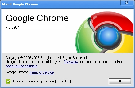
Chrome about boxChrome or Chromium?

The browser we’re going to install is actually Chromium, which is a free software whose Google Chrome is based on. Tu put things simply, Google takes Chromium source code, which is written by the community, adds it’s own logo and features, labels it Google Chrome and adds its own terms of use.

Note the absence of the link to Google Chrome Terms of Service in the Chromium about box.

Getting Chromium latest release using PPAs

Chromium about box

My favorite method for getting Chromium is by using the Chromium Daily Build Team’s PPA. It allows you to fetch the very latest version of the software, which is updated at least once a day, so do not try that if you are working in a very stable environment.

In order to activate the PPA for your Ubuntu setup, just enter the following into a terminal:

sudo add-apt-repository ppa:chromium-daily

You can then grab the latest version:

sudo apt-get install chromium-browser

Starting Chromium

A shortcut should have been created in your Applications menu (or K menu in KDE), if not, simply start it with the command-line:

chromium-browser

That’s all, enjoy your newly installed browser!

Design a site like this with WordPress.com
Get started